
E – Evaluate
In the previous article, we talked about how the Implement phase of training content development applies to journalism. You can read that article here. In this post, I’ll wrap up the series with a discussion of the Evaluate phase.
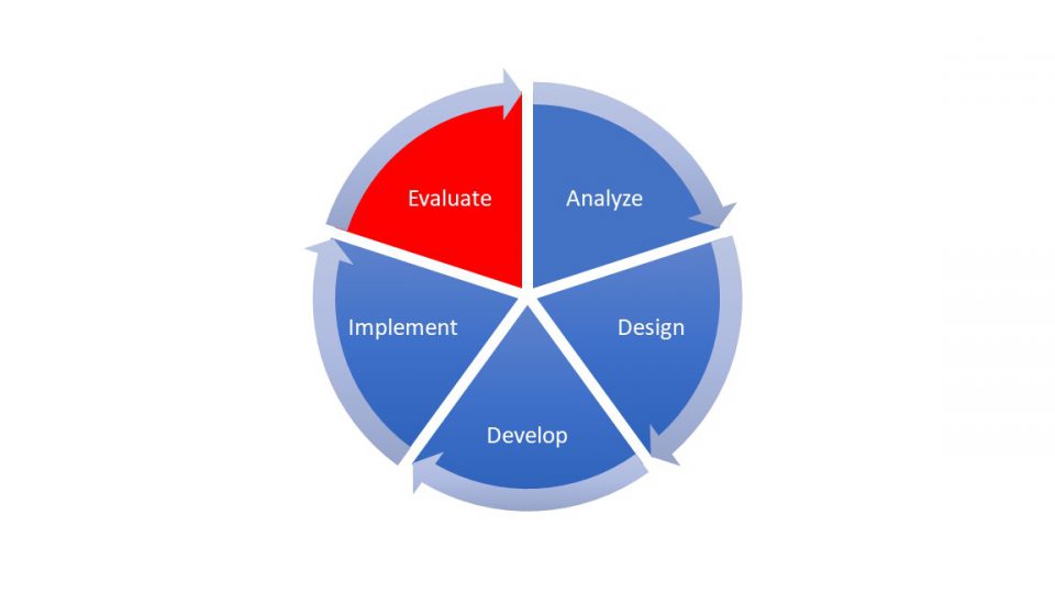
As a reminder, the 5 phases of content development are:
E – Evaluate
The Evaluate phase is both the last step of the content process and the first step of the next round of changes or fresh content creation. It’s also the one folks often skip.
We started with goals and learning objectives in the Analyze and Design phases. Now we need to know if we achieved those goals and learning objectives That’s why we worked to establish that definition of success in the Design phase. We also want to know what went well, and where we can improve in our execution or if we need to make changes to the content itself.
- Learner reaction: One task is asking learners to complete a survey about their experience. I use Microsoft Forms to conduct an anonymous survey after the session that asks learners about thing like:
- How much they learned
- How likely they are to use what they learned on the job
- How what they learned will impact their productivity
- What else they would like to learn
- What was most and least valuable
- How effectively the trainer trained
- Tracking learner reaction: I keep most of the questions the same from one session to another. That way I can track responses over time and from customer to customer. This way I can identify common themes and requests across groups. I have a large Excel spreadsheet with charts and pivot tables for all these responses that I download from Forms.
- Tracking and sharing attendance: At the end of the month or quarter we want to evaluate our attendance numbers. I track attendance at a session and views of the recorded session in with the new Microsoft Lists tool, which integrates with Teams to give me overall numbers or lets me filter it for specific details. I use pivot tables in Excel to break out the monthly data I pull from video analytics.
- Anecdotal feedback: I use the Teams chat threads from the training session itself. I go back after a training to make notes of the things that seemed to confuse folks. I also collect the questions that people ask because looking at the themes that emerge over time can help guide future content creation plans.
- Reporting: Often, I’ll grab a screen shot from the chat thread, past that into OneNote, and let OneNote convert that back into text. When I produce reports for my stake holders, I can put those screen shots right on a PowerPoint slide for a more compelling visual. I can include Excel pivot charts summarizing the data I get from the surveys. I can embed video clips from the sessions themselves if I recorded the session in Teams and uploaded to Stream. All the tools can come together in different ways.
How well a reporter or reporting team executed on a topic can be measured in multiple ways, from audience numbers and web analytics to policy change and community action.
The exact feedback mechanism will be highly dependent on the media at play. The Microsoft 365 suite provides a number of tools for collecting, sharing, and implementing that feedback to more effectively inform and educate the audience in the future.
Microsoft Forms is a great way to get audience input. Excel is useful for crunching those numbers or analyzing web traffic. Teams meetings excellent tools to debrief colleagues on how the audience is reacting to a story.
And all those insights can go straight into a OneNote notebook or Teams channel and be used to make improve in the future.
Completing the evaluation phase provides key data to make story telling even better as this data flows into the analysis phase of the next story. That doesn’t mean each and every story needs a full-blown survey or data-analytics process tied to it. The bigger or more resource intensive ones? Sure.
But at the very least after each story, it’s worth taking at least a few moments to ask:
- What went right?
- What didn’t work as well as I’d hoped?
- What ought I do differently next time?
- What did I accomplish?
Those are all learnings that can feed future content. After all, we don’t have to be the absolute best at what we do today. But we do need to get better (at least a little bit) tomorrow.
While the ADDIE framework may not have been designed for journalism, it is a useful framework as we all want our audience to be and to feel more knowledgeable and informed than before they encountered us.
To learn more about the training program for journalists that covers topics such as rolling out Teams and using collaborative editing, creating transcripts, or using data visualization tools, you can read this article.
Let us know if this framework is helpful for you! Find is on LinkedIn at Microsoft News or email us at [email protected].


