Data is a paradox. We gather data to get a better understanding of how we function as a collective, from school attendance to census counts, from crime rates to home purchases. Each number represents a measurement of an action or a community. The goal of a dataset (when properly gathered and tabulated of course) is to present a numerical portrait of a moment in time.
Yet while data is crucial to figuring out how to make law, allocate resources, or simply understand the space around us, tables that showcase seemingly endless rows and columns might leave some bemused — even benumbed.
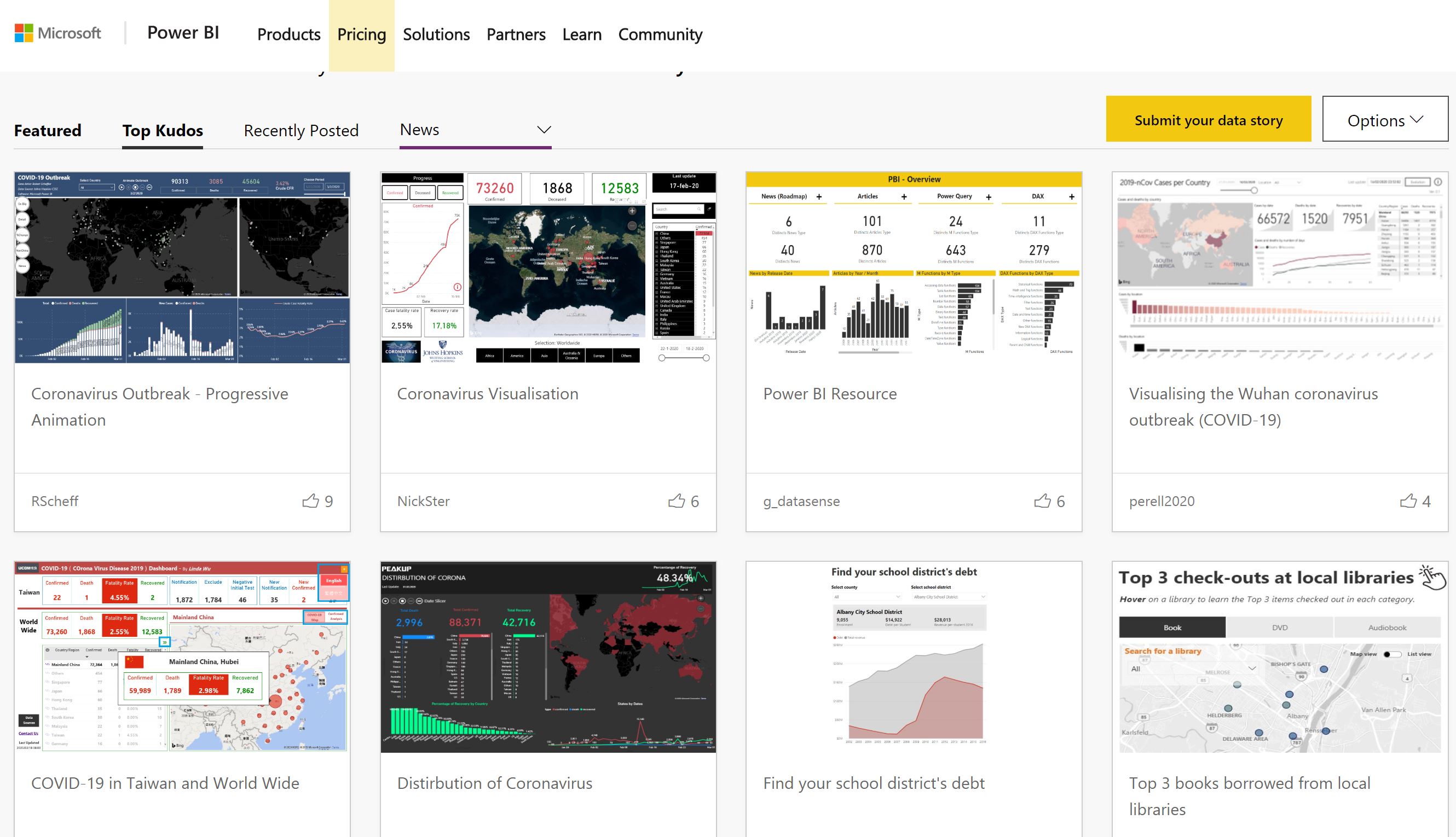
On the other hand, a compelling data visualization invites exploration. Some visualizations can be beautiful, like computational works of art. Some great tools are out there to help bridge data and art: Power BI, a business analytics tool that spun off Excel, has produced gorgeous dashboards for self-service analytics. Those interactive visualizations also turn out to be fabulous for data journalism.

We here at Microsoft News have partnered with outlets such as the Associated Press and Politico EU to help them express data into trusted news, one in which their audiences can dive into the numbers firsthand and learn information that’s deeply pertinent yet also imparts a larger story. This week at NICAR20, a data journalism conference run by Investigative Reporters and Editors, we’re running two Power BI hands-on workshops.
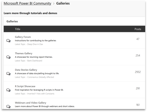
Now the Power BI Data Stories Gallery, which lets people upload their creations, has added a “News” category. The gallery is part of the Power BI community, a forum where 1 million active users come every month to ask questions, share tips and even collaborate. The gallery itself receives 1 million monthly page views and 750,000 visits (clicks into the posts). For journalists, this community space is not only a place for help and inspiration, but a distribution channel of sorts to share with a passionate niche.

Anyone can join the community and submit to the Data Stories Gallery. For newsrooms, it opens an avenue for new collaboration and audiences passionate about telling stories through data.
For other data journalism resources:

- Explore a data journalism overview (aka.ms/datajournalism)
- Download our playbook (aka.ms/datajournalismplaybook)
- Get more general step-by-step help in our Guided Learning
Vera Chan is Sr. Manager, Worldwide Journalist Relations, at Microsoft News Labs


