
Our society is swimming in data, measuring everything from rainfall rates to climate temperatures, from birth rates to global migration patterns, from burglary rates to offshored millions. Distilling measurement from movements small and large is already daunting. Imagine then the job of a data journalist who digs through rows upon rows of numbers to fathom their import, identify deep trends, then figure how tell those stories in ways that their audiences will grasp the significance.
Empowered by Power BI

Nearly all data junkies know Excel, for its massive computing power and pivot tables. Excel has long offered visual features that spins up charts on the fly. To go one step further to create interactive and beautiful interactives that render well on desktop and mobile, individual journalists and newsrooms such as the KING-5 (Seattle TEGNA station), Associated Press, and Politico EU have worked with us to use Power BI. We’ve also shared how this robust and deceptively elegant business intelligence tool can lend itself to data journalism at industry conferences like NICAR (National Institute of Computer-Assisted Reporting).
Now journalists and any data junkie can have a go at Power BI on their own. Find resources on how to sharpen your data journalism skills on our Microsoft 365 for Journalists tools and resources page. Here you’ll find:
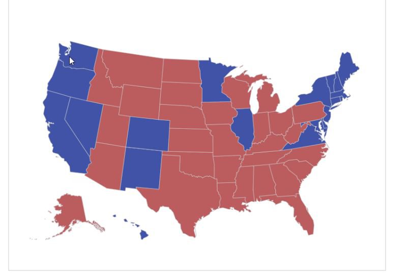
- Off-the-shelf vizzes on historical Voter Turnout and current Election Campaign Finance
- A ready-to-deploy COVID-19 tracker with county-level view
- A multi-part tutorial on how to dig into Power BI using Census data
- As well as tips and videos for how to use Microsoft Word, Excel, OneNote, Teams and more in your reporting
A tool for freelancers to newsrooms
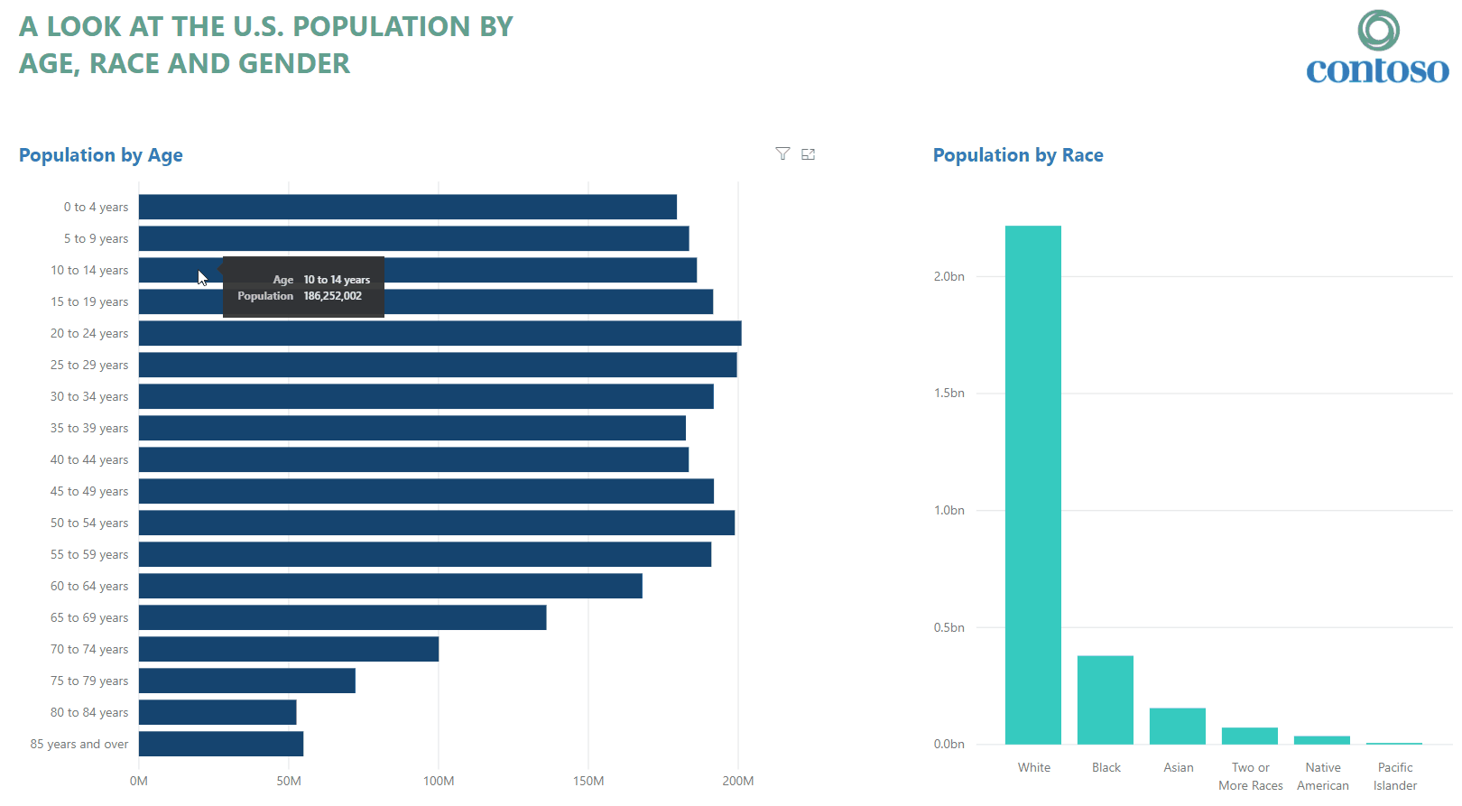
Power BI allows a reporter to act as both data researcher and graphics desk in one. It’s robust enough to link disparate datasets. For a publisher, the Publish to Web feature yields an embeddable iframe. For a reader, being able to narrow down on a pertinent data point and see how that ripples across multiple charts is invaluable: for instance, selecting a single state from a U.S. map to see Census information charts on age, gender, race and more in that specific region.
Data has always been fundamental to understanding the world around us and a cornerstone in reporting, but it’s a complicated process. Fortunately, there have been leaps and bounds in how even former liberal arts majors alongside mathematicians can have a go at calculating information and presenting them in ways that is compelling to audiences, who want their own level of control to judge the numbers for themselves.
Want to dig deeper than these vizzes?
We also encourage any data fan who’s an artist at heart to look at what people have built in the Power BI Data Stories Gallery (select “News” to narrow down the selection).
You can also join the community forum where Power BI neophytes and seasoned users share advice. There’s also lots of additional training material geared to designers, consumers, administrators and developers.


